You can use the color settings in your block to set the text color, background color, link color, gradient options, and duotone filters for your content. They are designed to make it as simple as possible to update your block’s colors.
The color settings available will vary based on the theme and the block in use.
How to access color settings
Colors can be set on a site basis or on a block basis. Setting color on a site basis will affect the color of the entire site.
How to access color settings for your site
- From your Administration Screens, Select Appearance > Editor
- Select Styles
- Select Colors
How to access color settings for a single block
Select the block you want to modify the color and open the Block Settings sidebar of a by clicking the Settings icon that is next to the Publish/Save button.

Find the Color options under these three locations:
- Typography settings to change text color
- Background settings to change background colors and gradients
- Elements color settings to change colors for child elements inside blocks like the Group block

Elements panel for nested elements
WordPress 7.1 introduced the Elements panel where you can customize colors for links and nested items within container blocks like the Group block.
Type of settings
Each supported block comes with different color settings.
Text and Background color
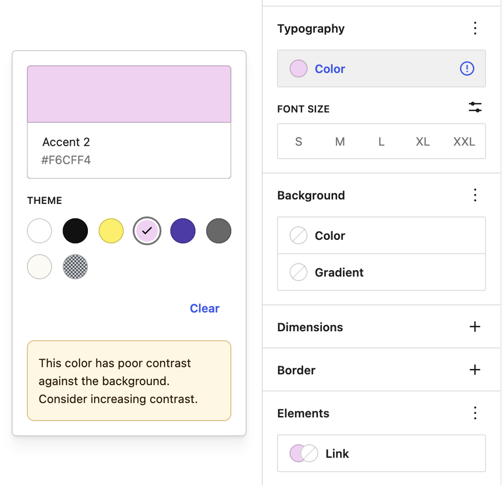
This option allows you to change the color of the text, and background on the block you are working on. Color settings vary depending on which theme you are using.

Accessibility tests are built into the editor to warn you when the text may become hard to read against the background color choices as shown.
Add a custom color
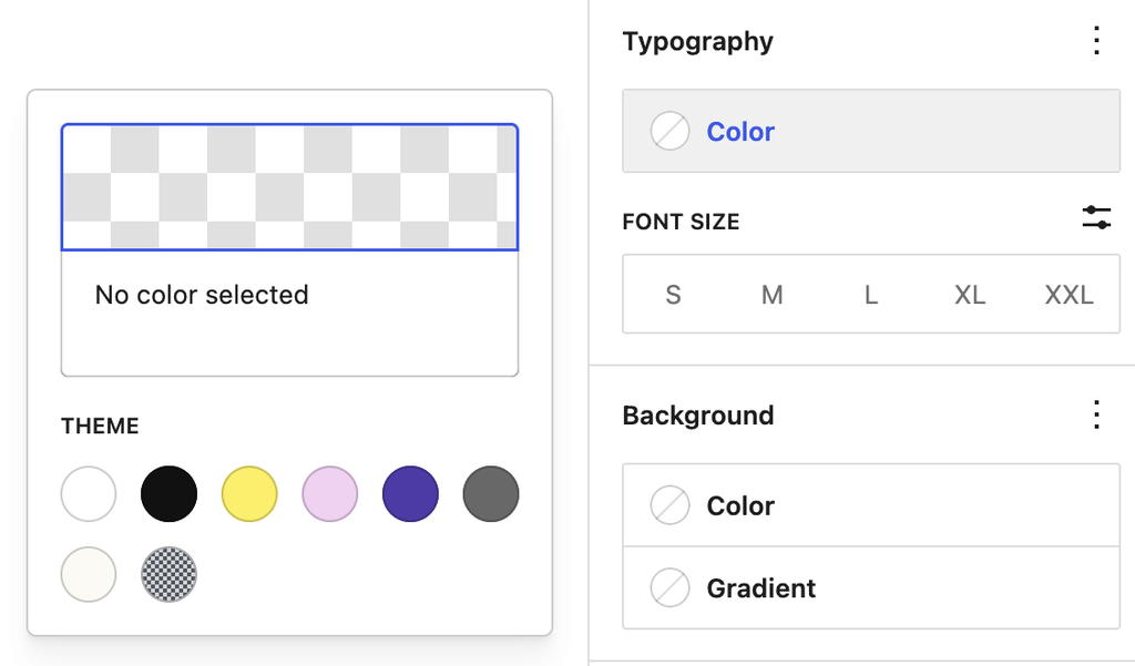
To add a custom color, click on the color box above the color palette options. It may read “no color selected” if your block is using the default color.
Next, you can paste in a color HEX code or named color value such as black, darkblue, or deeppink.


Gradient background colors
Some blocks such as the Heading block allow you to set either a solid color or a gradient as the background. A gradient is a mix of two or more colors, displayed using a certain pattern (from lighter to darker, or one color blending into the other).
A slider will appear that shows the two color points that make up the gradient.

You can click on any of the two color points to display the color picker for changing the color value. You can either choose a color from the color picker or enter the HEX, RGB, or HSL color values.
You can add additional color points if you like by clicking the + icon that appears when you hover over the gradient slider.
You can choose between the Linear or Radial gradient type. The angle control shifts the position of the gradient.
The Linear type creates a gradient between the two colors along a straight line, whereas the Radial type starts from the center and moves to the borders.

Duotone filter

You can create a two-tone color effect (called the duotone effect) on images without actually changing the original image
The duotone filter option allows you to add this filter color to your block content from the block toolbar. The filter can be black, white, or any other color combination of your choosing. The duotone effect works best on high-contrast images.
To get started, select the Duotone filter icon in the block toolbar. You can pick the two colors for the effect from the list of duotone presets provided in the drop-down.
You can also pick your own colors for the shadows and highlights by clicking on the Shadows /Highlights option which opens up the color picker and then selecting your custom color from the color palette.
If you want to remove the duotone filter you can click the Clear button found at the bottom-right of the color palette or by removing clearing the Filters option in the Block Settings sidebar.
Reset settings
When hovering over the Typography or Background Color options, if a color has been selected, a reset button (displayed as a dash icon) will appear. There is also a Clear button on the color palette selection.

Choosing these options will remove the applied color and reset the field to its default state, indicating “No color selected.”
Changelog
- Updated 2026-09-06 (props @awetz583)
- Updated screenshots and descriptions for 7.1
- Updated 2026-06-19
- Updated first three videos for 7.0 (props @awetz583 @moltilearn8)
- Updated 2026-05-23
- Added custom color section
- Updated 2025-05-04
- Add site’s color settings.
- Update screenshots and videos.
- Update 2025-04-22 (props to @nikunj8866)
- Add color reset button.
- Created 2022-11-01
Was this article helpful? How could it be improved?
Log in to submit feedback. If you need support with something that wasn't covered by this article, please post your question in the support forums.